Proposal
Spring Restaurant Group Website
Brief
Design Mockups
-
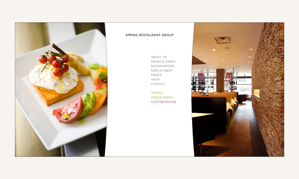
Splash page

This page is what the user sees when they first load the site. This page is simple and direct, establishing the identity of the restaurant group and reinforcing the high-end nature of the group's restaurants through the two flanking pictures, which shall reflect the aesthetics and purpose of SRG at a glance. A logo may take the place of, or reside underneath, the heading.
-
Landing page

A second or two after the user lands on the website, the central menu loads. The typography is sparse, giving weight over to the photography. The three SRG restaurant sites can be launched via the bottom-most links on the menu, and are color-coded to reflect the dominant color of each restaurant. The images on each side could possibly crossfade to other images in a slow slideshow.
-
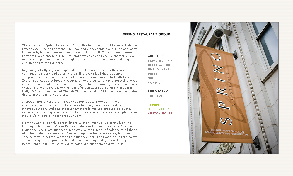
Second-level page

This is a typical second-level page. Content pages do away with the left-side picture and fill that space with information. The current site is very verbose, so this design accommodates a lot of text without looking cramped. The submenu that the "about" section has is laid out below the main menu.
-
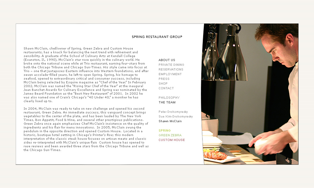
Third-level page

This site can hold pages down to three levels - the third-level menu is laid out below the second-level menu and does away with the all-caps.
Notes
-
Design direction
The site is much sparser and more austere than any of the three restaurant sites - as it is a corporate site, I feel that it should be more of a 'portal' into information about the group, or else a funnel into the three individual restaurants. The lightest touch of identity can be imparted onto the user when a corporate logo is decided upon and placed front and center on the site.
Design details
The site's containing rectangle is 900 by 450 pixels - a 2:1 rectangle size that fits within a 1024 x 768 screen, but is shorter than the golden-section 900 by 556 size I used for the Spring site. The more letterboxed site gives the user a slightly more cinematic, special experience than a more upright proportion would. I chose again to go for a constrained layout instead of a vertically-scrolling one in order to have more control over the user's visual experience.
Specifics
The title font is Avenir 35 Light 10pt in black. The body and menu text is Arial 10pt in grey. The menu colors turn darker grey for emphasis, and the three restaurant menu selections are in their representative colors - spring green for Spring, pale blue-green for Green Zebra and deep carmine red for Custom House.